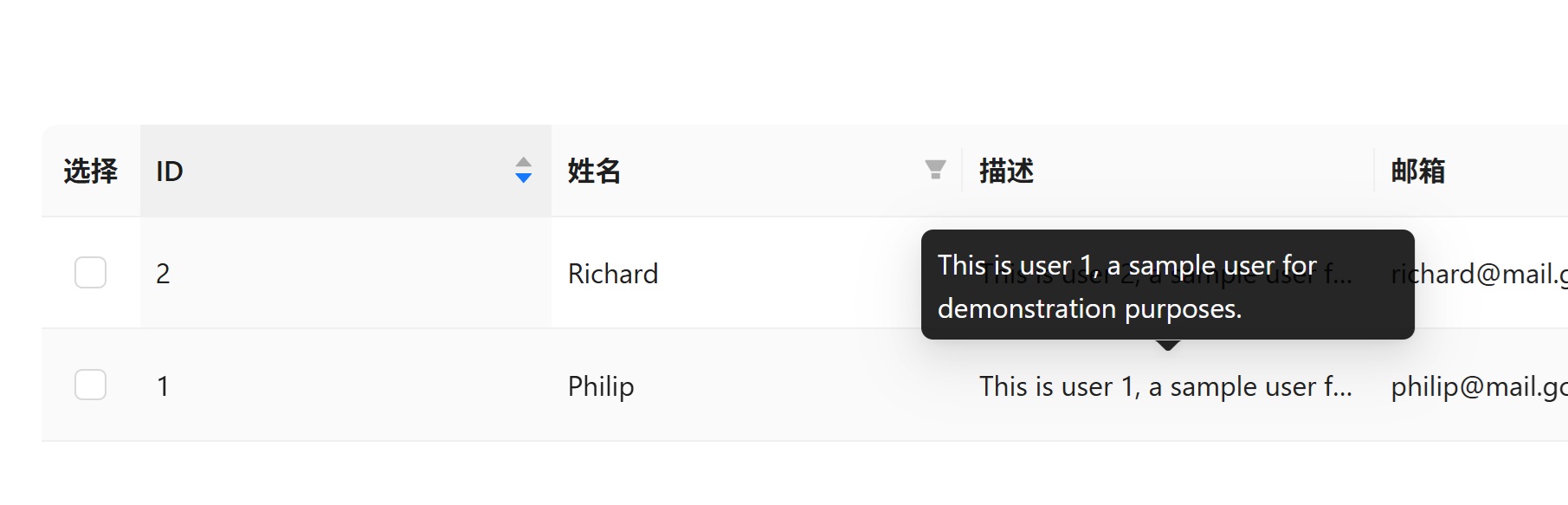
介绍 我们在使用Ant Design中的Table组件时,经常会遇到文本过长导致内容溢出的情况,今天我们来看看如何使用Ellipsis text来解决这个问题,所谓Ellipsis text,就是当文本内容超出指定长度时,显示省略号,为了功能的完整性,还需要添加一个鼠标悬停显示完整文本的功能,效果如下。
CSS中的Ellipsis 其实Ellipsis text是CSS中的一个功能,比如下面定义了一个ellipsis-text样式,当文本长度超过200px时,会自动显示省略号。
1
2
3
4
5
6
.ellipsis-text { width : 200px ; white-space : nowrap; overflow : hidden; text-overflow : ellipsis; }
下面来应用这个样式,其中title属性用来显示tooltip,其值和p标签的内容完全相同。
1 2 3 <p class ="single-line" title ="This is a very long line of text" > This is a very long line of text </p >
Ant Design Table组件中的Ellipsis Ant Design的Table组件中,Column组件提供了一个ellipsis属性来实现这个功能,非常的方便,只要在需要的地方添加ellipsis属性即可。
1
2
3
4
5
6
7
8
9
10
11
12
13
14
15
16
17
18
19
20
21
22
23
24
25
26
27
import { Table } from 'antd' ;const columns = [ { title : 'Description' , dataIndex : 'description' , ellipsis : true , }, ]; const data = [ { key : '1' , name : 'John Brown' , description : 'This is a very long description that will be truncated' , }, { key : '2' , name : 'Jim Green' , description : 'This is another very long description that will be truncated' , }, ]; const App = ( <Table columns ={columns} dataSource ={data} /> );
就这么简单,但是这个功能有些限制,对于纯文本内容来说还可以,但是如果你的列有自定义渲染器的话,这个功能可能会失效,比如我想将description列渲染成link button,在点击的时候显示一个弹框。这时候仅添加ellipsis属性就不够了,我们需要自定义一个组件。
1
2
3
4
5
6
7
8
9
10
11
12
13
14
15
16
17
18
19
20
21
22
23
24
25
26
27
28
import React from 'react' ;import { Tooltip } from 'antd' ;type EllipsisTextProps = { children : React .ReactNode ; maxLength ?: number ; } export default function EllipsisText (props : EllipsisTextProps const { children, maxLength = 30 } = props; const text = typeof children === 'string' ? children : String (children); if (text.length <= maxLength) { return <span > {text}</span > } return ( <Tooltip title ={text} > <span style ={{ display: 'inline-block ', maxWidth: `${maxLength }ch `, whiteSpace: 'nowrap ', overflow: 'hidden ', textOverflow: 'ellipsis ', }} > {text} </span > </Tooltip > ) }
上面我们自定义了一个EllipsisText组件,在这个组件中首先判断传入的文本是否超过指定长度(30),如果没有超过,那么直接渲染文本,如果超过了,则使用Tooltip组件包裹,并且应用了CSS的ellipsis样式。
使用方法如下,在Table组件的Column中使用自定义的EllipsisText组件。在这里我们将EllipsisText组件放在了一个link button中,这样用户点击按钮时可以触发一些操作,比如显示一个弹框。
1
2
3
4
5
6
7
8
9
10
11
12
13
14
15
16
{ title : '描述' , dataIndex : 'description' , key : 'description' , search : false , ellipsis : true , render : renderDescription, }, const renderDescription = (text : ReactNode return ( <Button type ='link' onClick ={onClickHandler} > <EllipsisText > {text}</EllipsisText > </Button > ); };
今天就到这里了,祝大家编程愉快,我们下期再见!