什么是外边距折叠(塌陷)
CSS Margin Collapse - CSS外边距折叠(也有叫外边距塌陷的),是指在某些情况下,两个相邻(或嵌套)的元素的外边距会合并成一个外边距,这个现象被称为外边距折叠。
外边距折叠的特征:
- 外边距折叠只发生在
垂直方向上,也就是说只有margin-top或者margin-bottom会折叠,margin-left和margin-right不会折叠。 - 发生外边距折叠时,会取相邻两个元素的外边距中较大的一个作为折叠后的外边距。
- 浮动元素和绝对定位元素不会发生外边距折叠。
发生外边距折叠需要满足如下条件:
- 相邻元素
- 嵌套元素之间没有分隔
- 空白元素
外边距折叠的例子
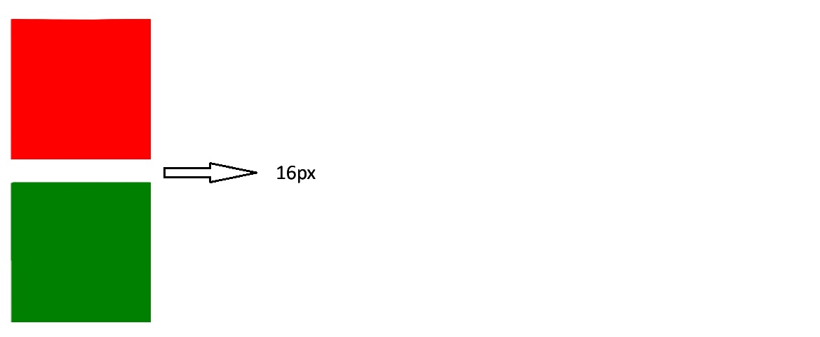
相邻元素的外边距折叠
以下两个div元素,宽高都是100px;上面的div元素为红色背景,底部外边距是16px;下面的div绿色背景,顶部外边距是16px;由于两个div元素上下相邻,故而发生外边距折叠,所以二者垂直相距16px,而不是32px。
1 |
|
如何防止相邻元素外边距折叠?
浏览器之所以有外边距折叠这个操作就是为了减少元素间的空白区域,所以大多数时候外边距折叠都不是问题,但是如果你非要禁止外边距折叠的话,可以参考下面的方法:
- 在相邻元素间添加隔离元素,比如上面的例子中,我们可以在两个div元素之间添加一个空的div元素,并设置其
display属性为flow-root,这样就可以防止外边距折叠了。标记为flow-root的元素会自动形成一个BFC(Block Formatting Context),从而防止外边距折叠。- 这种方式入侵性较小,而且不影响原来的布局,缺点是需要引入一个额外的div元素。1
2
3<div id="div1"></div>
<div style="display: flow-root"></div>
<div id="div2"></div> - 使用flex布局包裹两个div,flex布局内的元素不会发生外边距折叠。 这里我们也可以使用flex布局的gap来代替margin,方法是删除两个div中的margin,然后在flex布局中添加gap属性。
1
2
3
4<div style="display: flex; flex-direction: column">
<div id="div1"></div>
<div id="div2"></div>
</div>1
2
3
4<div style="display: flex; flex-direction: column; gap: 32px">
<div id="div1"></div>
<div id="div2"></div>
</div> - 使用grid布局包裹两个div,grid布局内的元素不会发生外边距折叠。
1
2
3
4<div style="display: grid;">
<div id="div1"></div>
<div id="div2"></div>
</div> - 给第一div添加
display: inline-block属性,产生一个新的BFC(Block Formatting Context),从而防止外边距折叠。上面四种方法都是通过产生一个新的BFC(Block Formatting Context)来防止外边距折叠的,BFC是一个独立的渲染区域,里面的元素不会影响到外面的元素,所以在BFC内部的元素之间不会发生外边距折叠。关于BFC更多的信息,请参考这里。1
2
3#div1 {
display: inline-block;
}
嵌套元素的外边距折叠
嵌套元素是指有包含关系的元素,这种元素之间的外边距折叠通常发生在父元素与第一个子元素或者父元素与最后一个子元素之间。
下面代码中,父元素是红色背景,宽高都是200px;子元素是绿色背景,宽高都是100px。虽然子元素设置了顶部外边距为16px,但是并未生效。
1 |
|
渲染结果如下,绿色方块顶部并未出现外边距。
如何防止嵌套元素外边距折叠?
处理嵌套元素外边距折叠的方法和相邻元素的处理方法差不多,都是利用生成的BFC来阻止外边距折叠。
- 给父元素添加
overflow: hidden属性,产生一个新的BFC(Block Formatting Context),从而防止外边距折叠。1
2
3#parent {
overflow: hidden;
} - 给父元素添加
display: flow-root属性,产生一个新的BFC(Block Formatting Context),从而防止外边距折叠。1
2
3#parent {
display: flow-root;
} - 给父元素添加
display: flex属性,产生一个新的BFC(Block Formatting Context),从而防止外边距折叠。1
2
3#parent {
display: flex;
} - 给父元素添加
display: grid属性,产生一个新的BFC(Block Formatting Context),从而防止外边距折叠。1
2
3#parent {
display: grid;
} - 给子元素添加
display: inline-block属性,产生一个新的BFC(Block Formatting Context),从而防止外边距折叠。1
2
3#child {
display: inline-block;
}